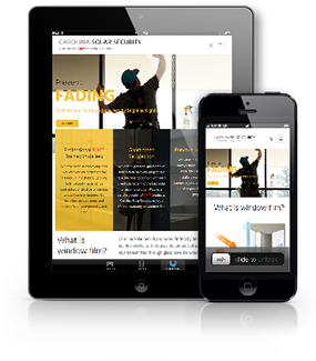 Mobile browsing has officially surpassed desktop! That statement is by no means news to anyone. Who doesn’t pick up their phone when then need something? We all thumb shop instead of sitting at a desk at a PC or Mac. As website designers we need to weigh mobile design as well as it’s larger version. A responsive site must look good and function on all screen sizes.
Things we designers used to fret over – large menu buttons hogging the entire screen – have been remedied by menus that are minimized for the small screen when the sites are responsive.
Now when we look at design ideas we start with what it will look like on a phone. We have to make sure the site is not only as functional on phones but the design is as vibrant and smart as the larger version. Sometimes large images that clients love, have to be sacrificed for better use of geography on the phone. There’s not room for everything. The large photos may cause customers to have to endlessly scroll to find what they want. We know that customers want to get to the reason for browsing, whether it’s finding a restaurant menu, ordering a cup of coffee or looking for a prom dress, as quickly as possible.
With online shopping, we have to be careful to make sure the shopping cart is as functional as it’s larger version. Images must be able to be stretched with 2 fingers without distorting and checkout has to be seamless. All calls to action must be strong and bold and serve the purpose of the website.
 Another element to consider in design is the fact that the phone can be rotated. The design can go from vertical to horizontal.
 It has to look good and function correctly on either axis.